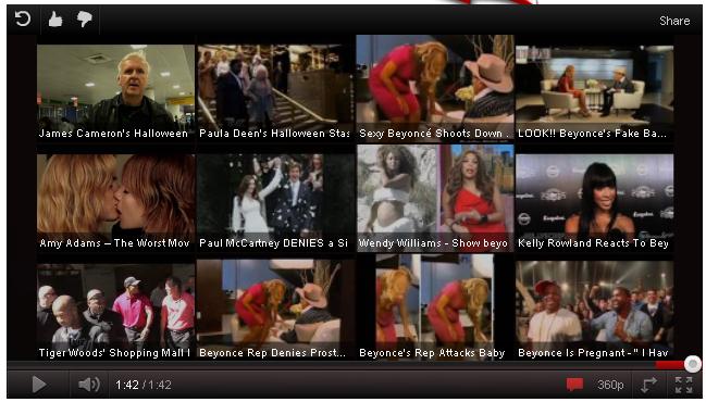
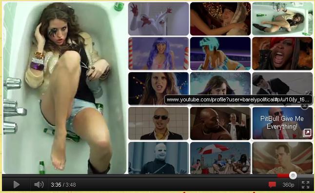
YouTube is occasionally showing users a new, re-designed related videos grid. You won’t see it at the end of every video (YT is probably just testing it), so here’s a peek.
I’ve seen lots of eye-tracking studies on video sites and users BURN the frame where the video is, so end cards like this get a really high click-through-rate. This is valuable real estate. Notice that share functions are much more hidden than before. YouTube is trying to encourage users to engage in longer viewing sessions — focusing them on watching another video rather than sharing, replaying or embedding. But sometimes giving users too many choices like this results in a poorer aggregate CTR, so we’ll see where this goes.
YouTube recently acquired Next New Networks and folded them into a “lab” part of the company focused on improving the platform for creators. This new design looks EERILY similar to the end cards that Next New puts at the end of each of their videos. Something tells me they had a part in this…
The main difference is that Next New’s end card is animated; the videos are playing versus the still thumbnails in YouTube’s design. This might up the CTR. But still — given the new redesign, is it worth creating end cards any more?
Update: Looks like this “end-screen” is here to stay. YouTube just announced it.

