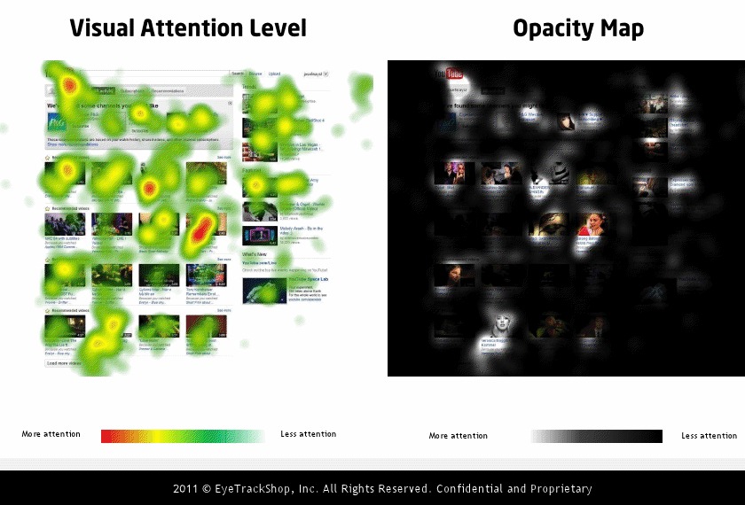
Mashable and EyeTrackShop did a study of several social media sites and buried in the data are two eye tracking studies on the YouTube homepage.
There’s little debate that thumbnails are critical to a video’s performance and this study punctuates that (especially in terms of subscribers, who get your videos through their homepage). But the study also reveals a little wisdom about what kinds of thumbnails specifically perform the best in a competitive environment. Here’s what you’ll notice:
- All of the top thumbnails contained faces and humans. The most effective ones were close-ups.
- The 3 most effective thumbnails featured women.
- The most effective thumbnail, by far, featured a close up on a woman and what appears to be a bright red heart.
- Most of the top 6 thumbnails had a high-contrast background in either black or white. Two of the top 3 thumbnails were actually completely in high-contrast black-and-white. Black-and-white thumbnails aren’t widely used so this is a really interesting discovery.
- The least effective thumbnails appeared to be pulled from “bootlegged” footage from TV or a movie.
- Thumbnail effectiveness trumps upload order and probably even title in terms of fixation.
- It appears that after a user sees a thumbnail, they read the title of the video.
Another interesting note — people are quite likely to fixate on their own profile icon and the adjacent functions there near the top of the page — comments and inbox. So, don’t count those out as effective ways to reach an audience.
