Category Archives: Audience Development

Why Netflix Needs a Mobile Content Strategy

Netflix is killin it and I continue to be bullish on their future. There’s one corner of the business I’m afraid they’re being just a little too pensive about: mobile.

This year, they’ve launched some of their first short-form programming and some new native portrait features in their mobile apps. But I’m afraid this won’t stop other mobile competitors — Google and Facebook — from locking them out of this critical piece of the entertainment pie. Now is the time for them to begin spending in the mobile content space and here’s how they should begin.

Why mobile is critical to Netflix

Let’s start with why Netflix should care.

There’s an obvious massive market of short form video consumption, well-proven by YouTube and Facebook. 34% of global internet video traffic is shortform. So, when Netflix says they’re competing with all forms of entertainment, this seems like an obvious adjacent area to pick up some additional engagement — whereas interactive, live and sports are much more of a moonshot.

But I think all of that frames this as a business expansion opportunity when I actually think this is a threat to Netflix’s stranglehold on the streaming market. Have a look at this graph, which explains the userflow of new subscribers to the service.
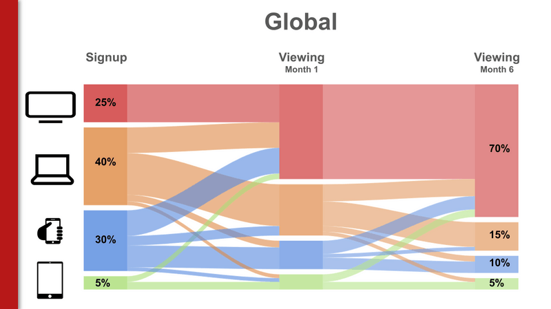
When this slide first broke, a lot of emphasis was put on the fact that after 6 months, 70% of Netflix subscribers were watching on a big TV. What stands out to me is that 10% are STILL watching on a mobile phone. Just 1 month in, more than 15% are still struggling to watch long form TV shows and movies on a tiny mobile screen. And right from the getgo, a full THIRD of Netflix’s new users start on a mobile device.

We are in a mobile world and who cares that people watch more content on their mobile phones — people TRANSACT more on their mobile phones. Enough people subscribe to Netflix straight through iOS that they’re trying to bypass Apple altogether — another sign of just how many folks sign up on mobile. Given that Netflix’s model is dependent on one giant transaction at the top of the funnel (their subscription), many more of their new customers are entering their ecosystem through mobile phones. And this user flows shows just how long it takes that mobile customer to begin finding big-screen-TV-type-value in their subscription. Were Netflix to actually provide valuable mobile content during that couple-month transition, they’d reduce churn among new users. (Still another strategy would be a freemium model of mobile-only content to lure users through the paywall when they realize the app’s value on another screen.)

What Netflix is already trying in mobile

Netflix is not completely blind to this. They’ve launched a few new short-form originals and mobile products this year. For those trying to reverse-engineer their mobile content strategy, here’s a recap of their short form content:

  • The Comedy Lineup (15 minutes) – Mini stand-up comedy specials
  • Explained (14-18 minutes) – Newsmagazine (Vox)
  • Follow This (16-18 minutes) – Newsmagazine (Buzzfeed)
  • Comedians in Cars Getting Coffee (12-25 minute) – Celebrity interviews with Jerry Seinfeld
  • Marching Orders (12 minutes) – Docuseries
  • Cooking on High (14 minutes) – Competition reality

In the scheme of Netflix’s $6 billion content spend, I’d call this an extremely modest beginning — it’s really just a test. It’s heavy on news and unscripted, there are no filmmakers, high-value talents or standout IPs. I estimate their 2018 spend on short form around $20MM at most. To make a meaningful move into mobile, they’ll need to spend 5-10x that.

How Netflix could form a mobile content strategy

It’s clear that Netflix needs to get into the mobile content game ASAP. But how? So many short form content platforms from go90 to Watchable have flamed out because of a lack of distribution.

Broadly, I’d approach this similarly to the rest of Netflix’s business:

  1. START FAST with a mountain of inexpensive mobile content that’s easy and fast to launch.
  2. PIVOT TO PREMIUM – Use the analytics gathered from starting fast to inform a mobile Originals strategy and finance exclusive new series.

Why this two-part strategy always works is the subject of a whole other blog post. But Netflix is in a unique position to build a war chest of start-fast mobile content at a low cost-per minute without sacrificing their premium values. Step one of fast/easy/quick mobile content — pretty obvious — is licensing. Now is a fantastic time to cheaply license premium mobile content. Every mobile content studio is clamoring to work with Netflix which earns them outrageous leverage. Plus, many of them were gifted back go90 or other mobile series that they have no place to distribute. The second source of start-fast content is probably less obvious: the content they already have. Netflix outright owns a lot of their shows and by getting creative, they’ll find a new life if they’re re-cut for a shorter runtime or carefully cropped for a vertical screen.

When audiences coalesce around their start-fast mobile content, they can decide where it makes sense to pivot to premium, maintain licenses or trim back.

In sum, I think mobile is a crucial growth area for Netflix and a place they have some natural competitive advantages. They could quickly turn a source of churn into a new source of revenue and expansion. I predict they’ll make some dedicated moves in this space but it’s going to take a larger commitment to realize the potential mobile content has in Netflix’s future.

Secret Access to Netflix’s Algorithm to Help You Understand Your Audience

I talk a TON about how important knowing your target is. You don’t have to be a marketer — even if you’re just MAKING content. You need to know your audience.

Netflix does an incredible job of analyzing their audiences and serving them targeted, empathetic content. And there’s a secret way of leveraging their algorithm, data and analytics to help you understand your own audience.

Secret Codes and Shelves of Targeted Content

Rant standup comedy category on Netflix

Rant Stant-up Comedy, TV Dramas and Understated Comedies are some of the categories on my Netflix homepage.

Netflix has an algorithm that creates “shelves” of movies and shows that they believe please certain content niches. If you use the service, you’ve probably noticed some of them like “Dramas Based on Real Life,” “Rock & Pop Concerts” or “Asian Action Movies.” Some of them get eerily specific, including ones that target specific children within 2-year age ranges.

If you’re trying to target a specific content audience, chances are, Netflix has a very specific category that caters to that target. You can use these shelves to see they types of shows that Netflix believes are “stickiest” for people in that psychographic corner of entertainment. Watch a few of these shows and you’re suddenly inside the mind of that consumer (their wants and fears) or at least beginning to understand what types of content you’re competing with.

The trouble is, Netflix usually picks when to serve these up to you based on your watches, likes/dislikes and preferences. So, if you’re a fan of Thrillers, you usually can’t view the content Netflix recommends for fans of Tearjerkers. The hack, which you may have seen before, is to find the specific “deep link” URL that’s assigned to the category you’re interested in. They follow this pattern netflix.com/browse/genre/#### and some smart people have made them conveniently available in lists like this one and this one. Click on the category or guess the right genre number and you go right to the page of content that Netflix recommends.

Are you targeting kids 11-12? Here are “feel good comedies,” “coming of age” and and just plain movies that Netflix thinks they’ll like. Looking to expand your understanding of the Latin American market? Watch all 182 movie here or get even more specific with “Latin American Crime Movies“. There’s even a section for “deep sea horror” fans.

(The most comprehensive list I could find was split between two pages on What’s On Netflix: Page 1 and Page 2. According to them, new categories pop up almost daily. InstantWatcher also has a good index. )

Getting More Detailed and Selling to Netflix

If you want to get even more granular, you can use these categories with a site like InstantWatcher which will let you narrow your target even more by adding filters like runtime, publish year and Rotten Tomato score.

I believe you could use this info to enhance a pitch for Netflix to buy a series from you. Netflix has said to THR that it doesn’t want content similar to other content they already have:

There’s some overlap but surprisingly little… as a general rule, the audience who watches House of Cards does not watch Hemlock Grove — and yet again, is not the audience that watches Arrested Development. We hope to reach the entire subscriber base with at least one original series by the time we’re done.

This makes sense because they want to attract households with diverse content desires and become broadly popular through many content niches. As Matthew Ball puts it, they want “underlap.” Hence their emphasis on Kids.

This could be important to a content pitch because you want to show them that your content isn’t “too” similar to the content they already have. If you want to make or sell content that doesn’t overlap with their existing library, you could browse categories that are empty or dial in an area in InstantWatcher that they’re lacking.

Pretty soon you’ll be making “Angsty British Military Zombie Sitcoms for Kids 8-9 Years Old.” But with the help of Netflix’s genres algorithm, at least you’ll know what that audience likes.

Eye Tracking Reveals New YouTube Thumbnail Tricks

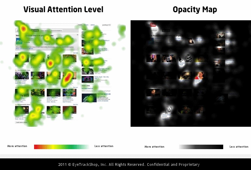
Mashable and EyeTrackShop did a study of several social media sites and buried in the data are two eye tracking studies on the YouTube homepage.

There’s little debate that thumbnails are critical to a video’s performance and this study punctuates that (especially in terms of subscribers, who get your videos through their homepage). But the study also reveals a little wisdom about what kinds of thumbnails specifically perform the best in a competitive environment. Here’s what you’ll notice:

  • All of the top thumbnails contained faces and humans. The most effective ones were close-ups.
  • The 3 most effective thumbnails featured women.
  • The most effective thumbnail, by far, featured a close up on a woman and what appears to be a bright red heart.
  • Most of the top 6 thumbnails had a high-contrast background in either black or white. Two of the top 3 thumbnails were actually completely in high-contrast black-and-white. Black-and-white thumbnails aren’t widely used so this is a really interesting discovery.
  • The least effective thumbnails appeared to be pulled from “bootlegged” footage from TV or a movie.
  • Thumbnail effectiveness trumps upload order and probably even title in terms of fixation.
  • It appears that after a user sees a thumbnail, they read the title of the video.

Another interesting note — people are quite likely to fixate on their own profile icon and the adjacent functions there near the top of the page — comments and inbox. So, don’t count those out as effective ways to reach an audience.

YouTube’s Secret New Related Videos Design

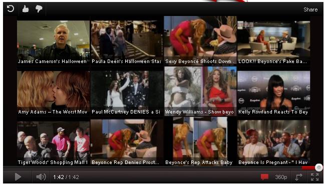
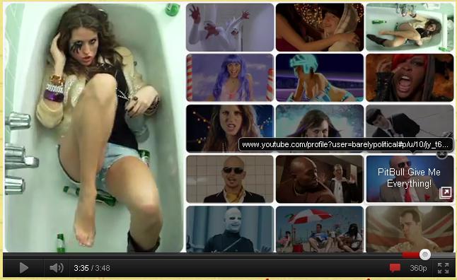
YouTube is occasionally showing users a new, re-designed related videos grid. You won’t see it at the end of every video (YT is probably just testing it), so here’s a peek.

I’ve seen lots of eye-tracking studies on video sites and users BURN the frame where the video is, so end cards like this get a really high click-through-rate. This is valuable real estate. Notice that share functions are much more hidden than before. YouTube is trying to encourage users to engage in longer viewing sessions — focusing them on watching another video rather than sharing, replaying or embedding. But sometimes giving users too many choices like this results in a poorer aggregate CTR, so we’ll see where this goes.

YouTube recently acquired Next New Networks and folded them into a “lab” part of the company focused on improving the platform for creators. This new design looks EERILY similar to the end cards that Next New puts at the end of each of their videos. Something tells me they had a part in this…

The main difference is that Next New’s end card is animated; the videos are playing versus the still thumbnails in YouTube’s design. This might up the CTR. But still — given the new redesign, is it worth creating end cards any more?

Update: Looks like this “end-screen” is here to stay. YouTube just announced it.